Intro_
In addition to our project work, we’re continually developing our YourMapp product. Recently we’ve been looking at improving the user experience while downloading content. What initially might seem like a simple process turned into a complex web of what-if scenarios.
Key to YourMapp is the ability for customers to manage their own content. This means that downloading data becomes the very first user experience of the app, so we felt it merited special attention for improvement. With that, we started to consider the user-story that surrounds a user’s first moments with the app. We were conscious that we want to enable users to get started with the app as soon as possible, with minimal effort or thought.
With external factors such as connectivity and file size affecting the speed of content download, we worked out what the minimum amount of data was needed for a user to get started in the app. To do this, we built an algorithm that downloads the minimum amount of data and initial imagery, before moving the remaining data download to a background task. Excellent. Job done.
Not so much. We want every user to have the best possible experience with the external factors that affect them. We considered every scenario and found lots of questions that needed answering. How does the user know what is going on? How does the user continue using the app with the minimum of disruption? What happens if a user tries to view something that hasn’t downloaded yet? What if the user is on a bandwidth limited 3G connection? What if the connection drops out part way through? What if they restart the app?
We also ended up with similar questions arising when the system detects that there is an update to the data available. Should we allow the user to choose when and whether they download the data? Should we allow the user to choose when they install the update. How quickly can we make the new data available?
The result of this was a defined specification which defined the logic and functions required to handle these scenarios. Some, we could handle automatically and others required user involvement. The outcome was the introduction of two new components for user feedback and choice.

First time use
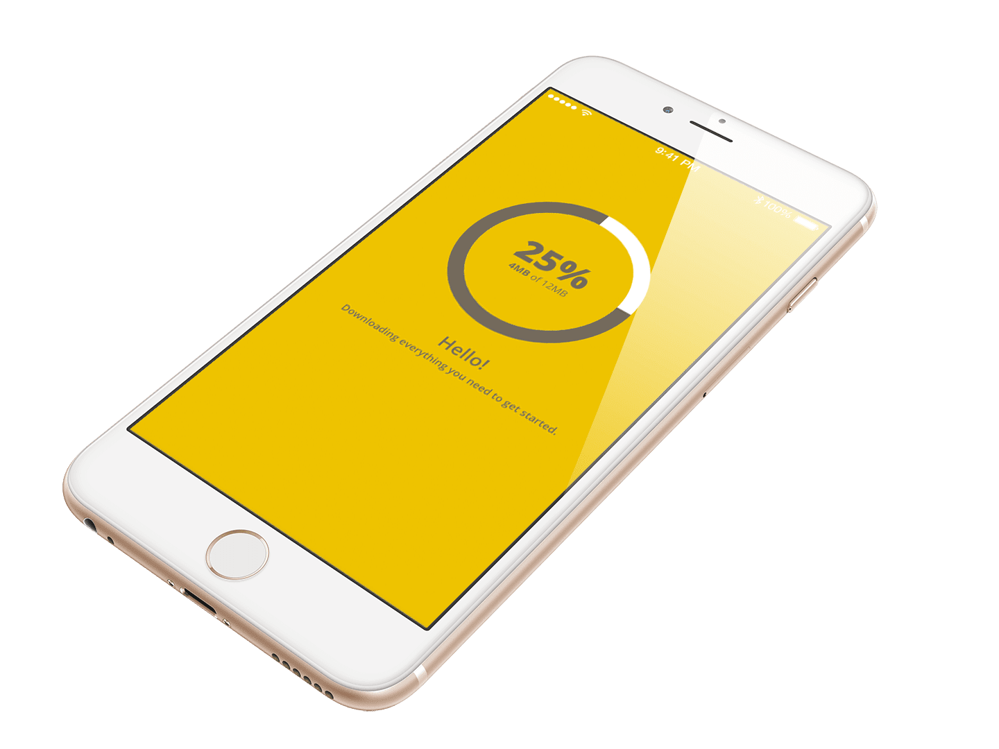
In an ideal world, nobody would have to wait for downloads but inevitably we need some content before our users can get started. Clear messaging and real-time progress was a simple, yet valuable addition to the first time use of the app. With this, the user knows exactly what’s happening and when to expect it to be done. For the data-limited, we defaulted the first time download to only commence while the device is connected to wifi.

Updates
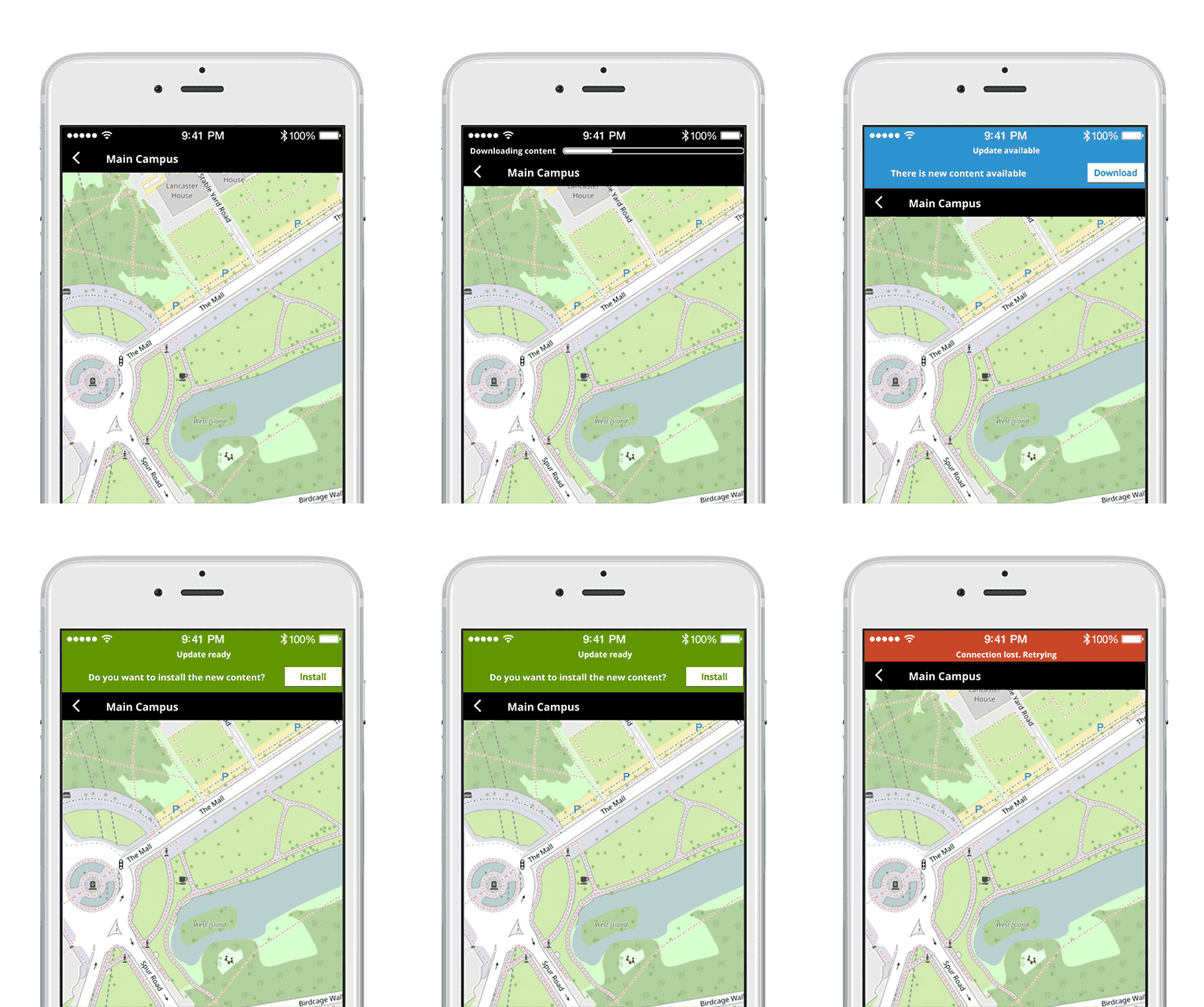
For content updates, we needed to balance consideration for the user already using the app with the fact that the new content update may include important updates that the user should install to ensure they view the latest information. To achieve this, we designed and built a new unobtrusive user-feedback component. Only appearing when it needs to, the component asks questions to users, only when necessary. We were careful to ensure that the app could be used fully, even when messages are shown. We particularly felt it important that if user input is required, we limit it to a single non-ambiguous question using simple terminology, and which requires a single choice of answer from the user.
Of course behind the scenes we are doing much more than we let on, with background tasks downloading to a temporary cache and much more, but the user doesn’t need to know all that.
Its this sort of level of detail that can make a big difference to the user experience and its this sort of level of detail that we typically have to work through with our customers on projects in order to understand what’s right for their project.